
Monday, May 21, 2012
Batman Pop Art

Thursday, May 3, 2012
1 Word Text Illustration - Hotel Rwanda


Tuesday, February 28, 2012

Hands

Instead of more collage-based look, I decide to add in a bit more unity by making the hands revolve around the center. Used different colors for diversity, with all hands reaching for the same desire. Equality.
Thursday, January 19, 2012
250 Years of Charlottesville
 I incorporated various memorable locales in Charlottesville. From left to right; Venable Elementary, Downtown Mall, UVA Rotunda, Pavilion, Monticello. I made the pictures fit more seamlessly by using a rough eraser on the sides. I figured that the blue ridge mountains were the perfect background since they literally are the backdrop of Charlottesville and all the pictures are set at the base, further relating to the literal location. I made a contrast of the lightly colored "250" with the bold "historic Charlottesville" text. Finally, I made a slight black gradient at the bottom to cover up any sharp edges.
Tuesday, January 10, 2012
Book Cover Assignment
 For this piece I first created a custom shape and used the direct selection tool to get the shape exactly how I wanted it. Ultimately I scoured some websites for the high quality images and inserted them accordingly, having to cut images to make them fit. Finished up with an outer glow on the edges of the shape and curved title letters.
Tuesday, November 22, 2011
Lorax

Thursday, November 3, 2011
Cake Sprinkles

Tuesday, November 1, 2011
Other Edit

Thursday, October 20, 2011
Painting
 For this assignment I chose a picture I took last year of a car that has somewhat grown into the land around it. I chose to overlap the picture using various paint brushes, instead of deleting the original layer and only using the part I manually painted. I tried to use the different brushes for the effect of a different texture (metal, leaves, etc.). I'd say I'm satisfied with it although there are quite a few little pieces that could of used more time, but overall I thought the outcome was up to par.
Tuesday, September 20, 2011


Monday, June 6, 2011


Friday, June 3, 2011
Kaleidoscope

I found my own tutorial for this one so it might not look like the others. Nevertheless, the original picture was melting mushrooms and I put a smaller copy in the middle.
Wednesday, June 1, 2011
Color Wheel
 For this project I used a gradient background with other edits to that included. The spots were made with some variations to the paint tool (hue jitter, scattering). The nautical stars all contain a fractal design and these were edited with filters as well. Finally, I added shadows with motion blur as a final touch.
Thursday, May 26, 2011
Advertisement
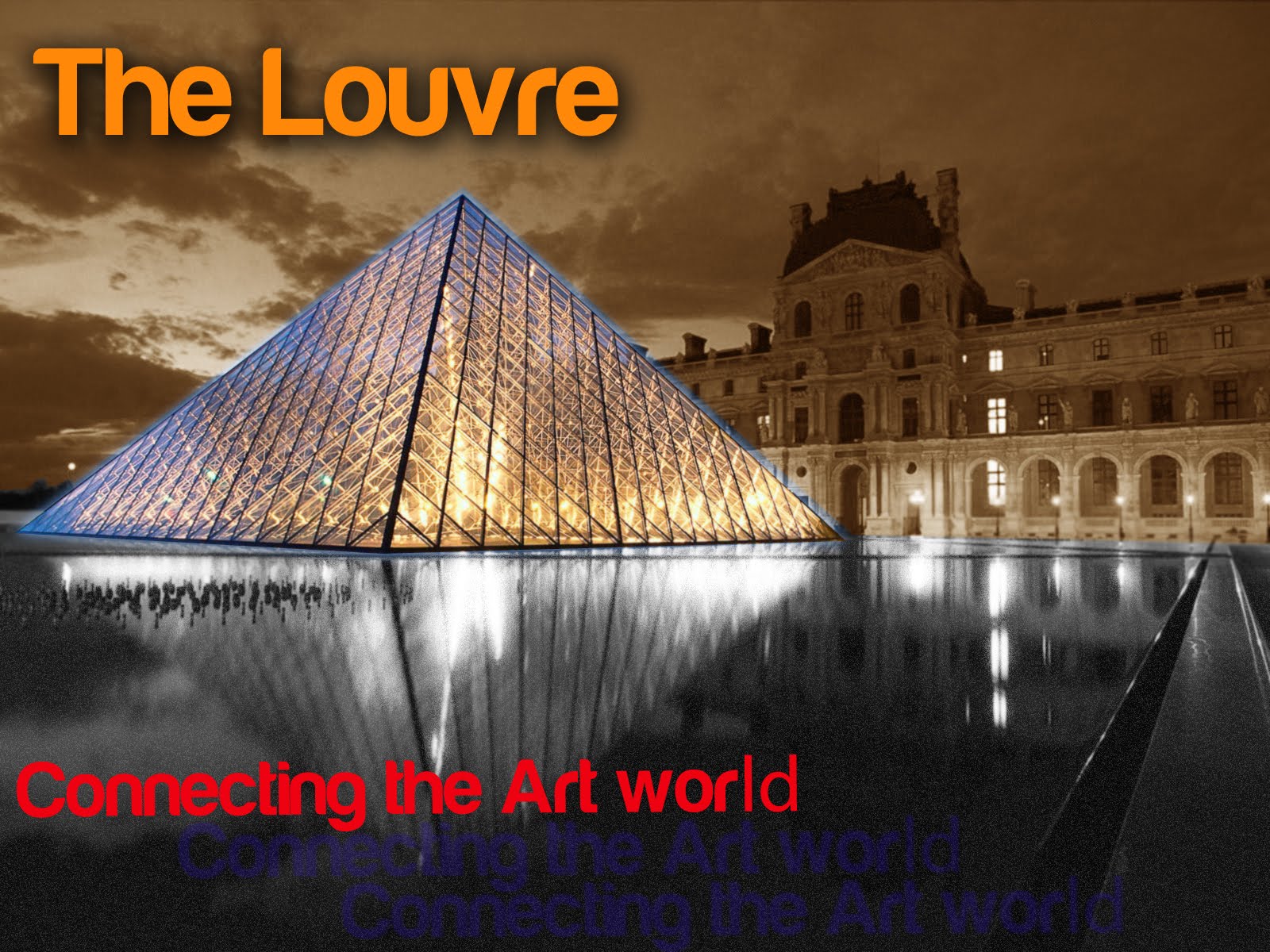
I was leaning towards something from the art world on this one and so I went with the beloved Louvre. Mainly added an outer glow to the glass structure and divided the pond and sky with black and sepia, respectively. Diffuse glow also was added to the water. Overall, I went for a simple yet structured design.
Monday, May 9, 2011
 The picture above is taken from the Crown Fountain at Millennium park in Chicago. The structure is composed of 2 glass brick structures containing LEDs which create the image of a human face that rises 50 feet high. The artist was to be chosen by means of a design competition and the decision was made to commission Jaume Plensa, who is from Barcelona. He's been creating public commissions in Europe and Asia since the 1980s, although this was the first one he's done in the U.S.
Plensa is also known to incorporate light sources into his work as well as including aspect of dualism, which is seen here with the addition of 2 structures. When asked about what he thinks about public projects, he responded, "It's not just a geographic area, but a place where people do something just by passing through or relaxing or eating. Public spaces are an expansion of your body, your home. They are another circle."
Thursday, April 14, 2011
Custom Chair

I searched for abstract backgrounds to put on the chair. I used shadow on the panels to give an established look and also to make it look less rough around the edges. I had some hard times with the shadow...
Wednesday, April 13, 2011
9 X 9 Portrait
 No particular theme I stuck to in this one. The borders I felt had a rough, kind of graffiti look.
Subscribe to:
Posts (Atom)