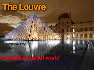
I was leaning towards something from the art world on this one and so I went with the beloved Louvre. Mainly added an outer glow to the glass structure and divided the pond and sky with black and sepia, respectively. Diffuse glow also was added to the water. Overall, I went for a simple yet structured design.
No comments:
Post a Comment